Is your brand ready for the great “open up” when lockdown ends? If it’s in need of a new look for the “new you”, or maybe just a freshen up, then now is the time to get started.
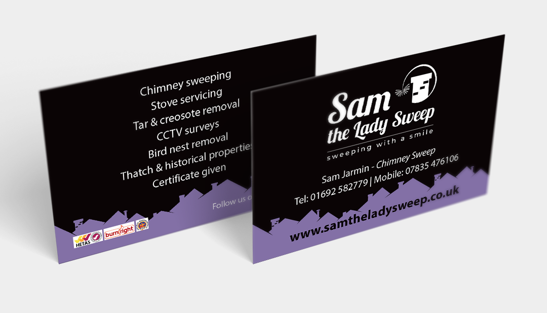
We worked with Sam the Chimney Sweep last spring, to create a new brand identity for the business. Sam wanted to keep a feminine touch, without going too over the top, her main priority was to convey a personal touch, rather than a more corporate style. So her keywords were “personal, friendly, reliable, family”.
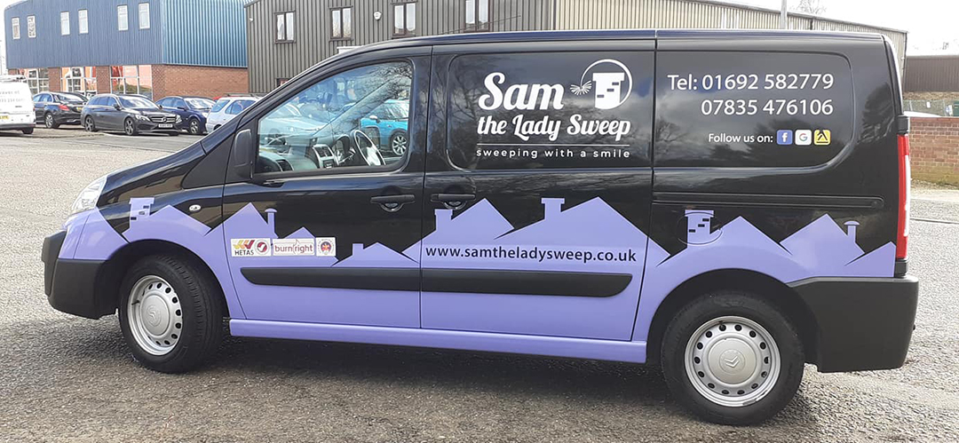
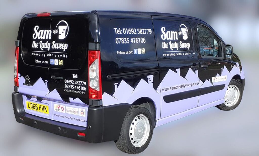
The existing company website used lilac as a main colour, so we picked up on this as Sam liked the colour, but also introduced a strong black, knowing that the company van is black and would have to be able to pull off the new branding.
As usual we presented 6 designs for proof 1, and working together came up with the final logo design. The logo shows exactly what the company does, the chimney brush is curved to form a circle and almost flower like to keep it quite soft.
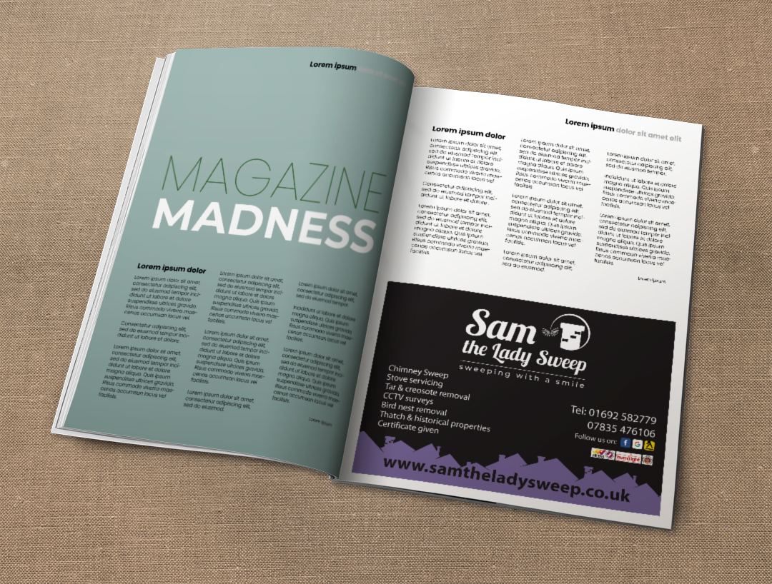
Next we moved on to the van design, and introduced the chimneys along the bottom, to give make van stand out on the road. We carried this through to the business cards and local advertising too. Branding isn’t just about the logo, it’s the whole look and we are very happy with this one!
Contact us to see how we can help your brand.