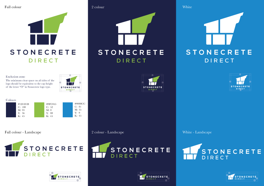
We recently created a new logo for local company Stonecrete, to update their corporate identity. We began by discussing what kind of look they would like to achieve “traditional with a modern twist” was the reply “possibly in blues, greens or greys”. We produced the first proof, with the usual 6 different design concepts, then worked together to hone the ideas. With a modern looking rounded font with plenty of kerning between letters, to enable the logo to appear crisp and clear even in small sizes, and an icon which represents their product, the final design definitely fits the bill. Using a traditional navy blue to tie in their existing branding, with a brighter vibrant green as a secondary colour, we achieved the mix the customer was looking for. The brighter blue gives scope for accent colours.
We produced a full colour, 2 colour and white version of the final design and a logo guideline sheet to show how the branding should be used, with the colour specifications.
As always, the customer received the files in both print and web formats, ready for us to continue with rebranding items as needed, rather than all at once. We believe the new branding will be used on the website very soon, and we are due to start working on an update to the product catalogue.