- px2-demo
- July, 2021
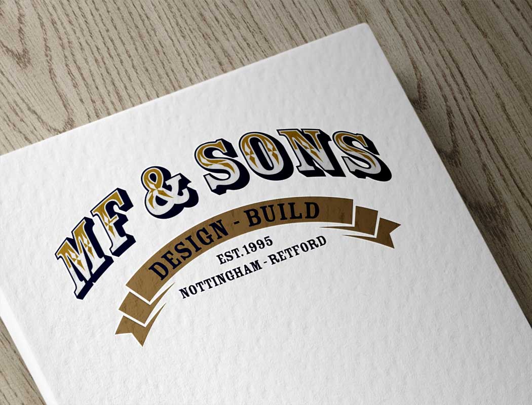
MF & Sons Ltd – Brand Design
I’ve recently been working with a builder, who came to us from another client recommendation (the best way!). We had an initial chat on the phone, and the things which came over about the business was their strong traditional craftsmanship skills, the fact it’s a family business – with 3 generations working together, and that they offer design and build services under one roof.
It was clear they wanted a traditional feel to the branding, with a modern twist. They loved navy and gold, and also were inspired by vintage hand sign writing, on the likes of canal boats and haulage companies.
It was such a fun project, with my initial set of 6 ideas ranging from simple lettering, to a very ornate almost circus feeling, to gauge the direction the customer wanted to head in.
I lOVE the final design, it is minimal yet decorative at the same time. With just the right amount of traditional, but not old fashioned looking. I can’t wait to see the brand develop and work with them again soon.